

|
|
|
|
By Editor Miro Susta
Edited and published by Yvette Depaepe, the 16th of November 2026
Much of the time spent on day-to-day photography is devoted to achieving perfect sharpness, controlling noise and selecting the right focal length. However, careful use of colour is a dominant yet often underestimated factor in the successful composition of a picture.
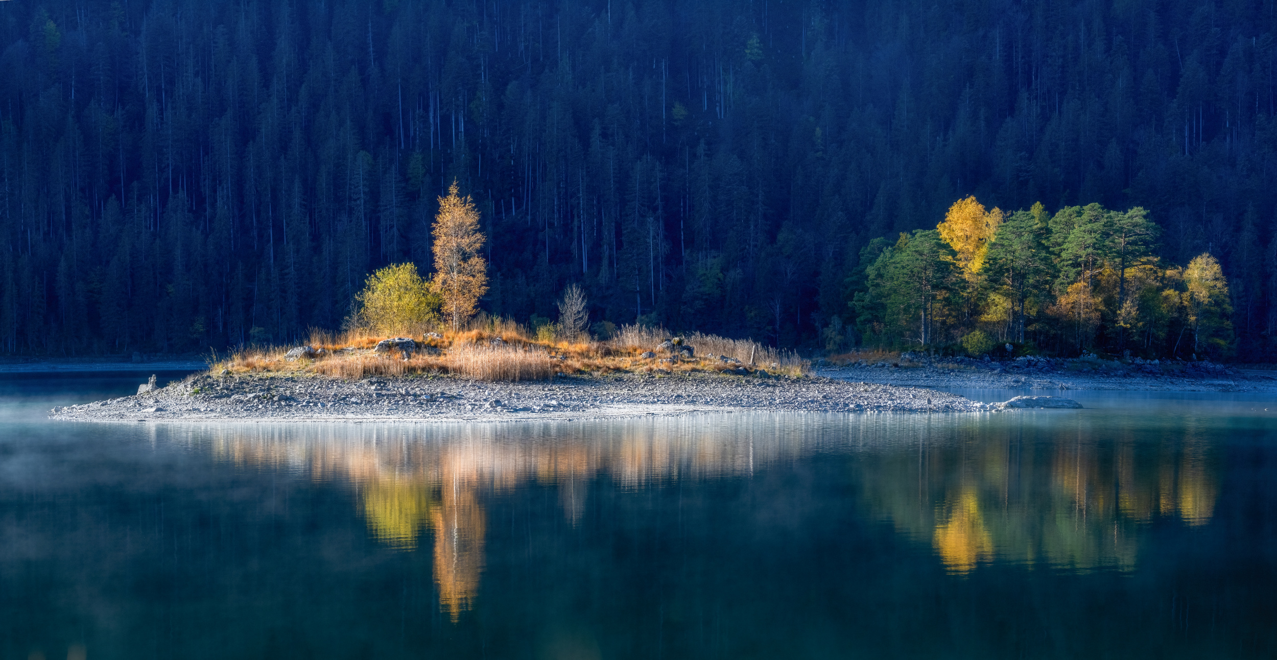
“Autumn at lake Eibsee” by Ulrike Eisenmann
Yellow is the brightest colour in the spectrum and therefore presents a challenge to photographers. It has an enormous visual presence that inevitably draws the viewer’s attention, but there is a risk of overexposure or a one-dimensional appearance.
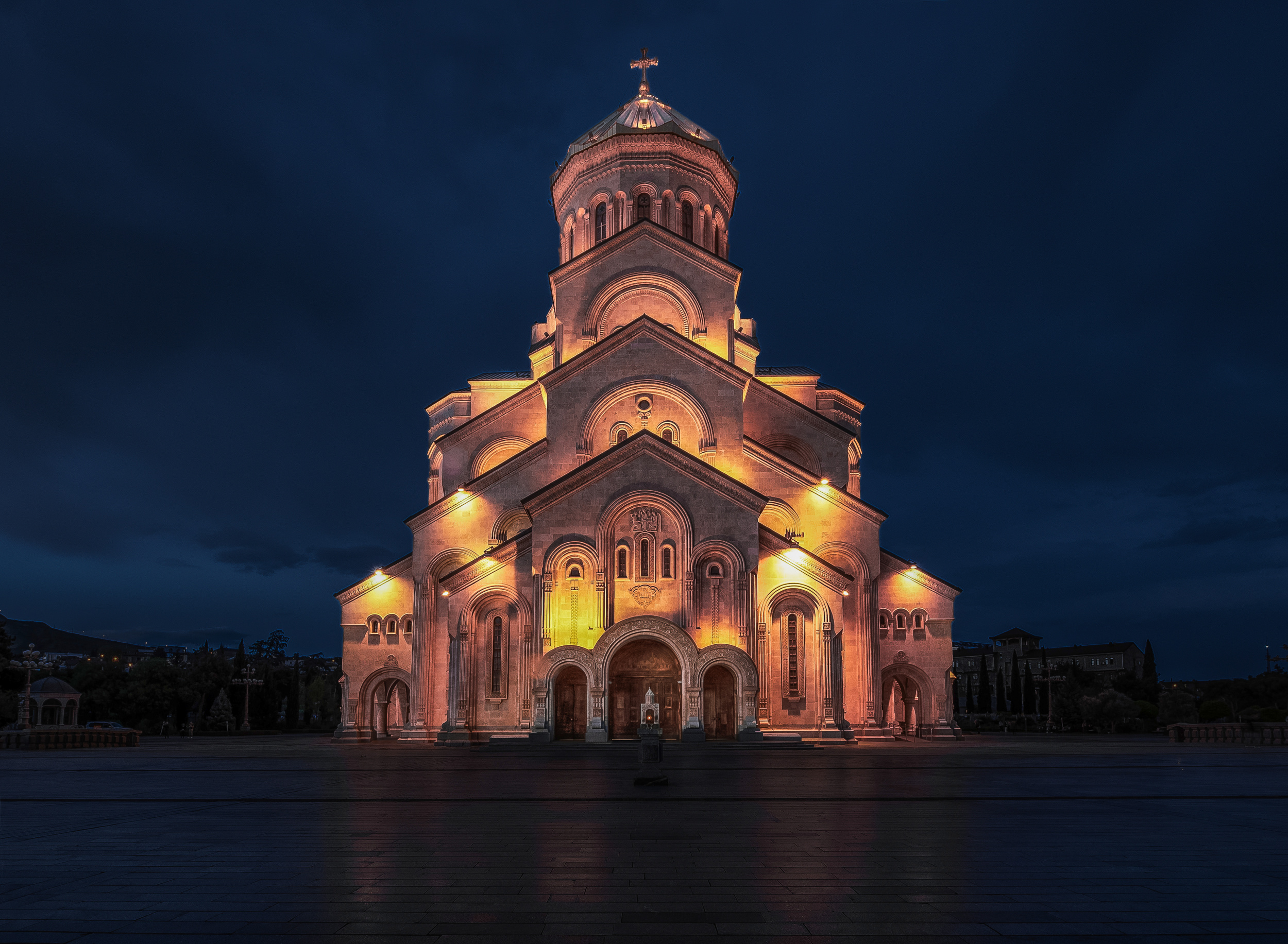
“Glow” by Rana Jabeen
The solution to this design problem lies in the deliberate use of complementary colours that contrast with each other. By placing them strategically, the brightness of yellow can be tempered and used to create depth, tension and emotional impact in the photo.
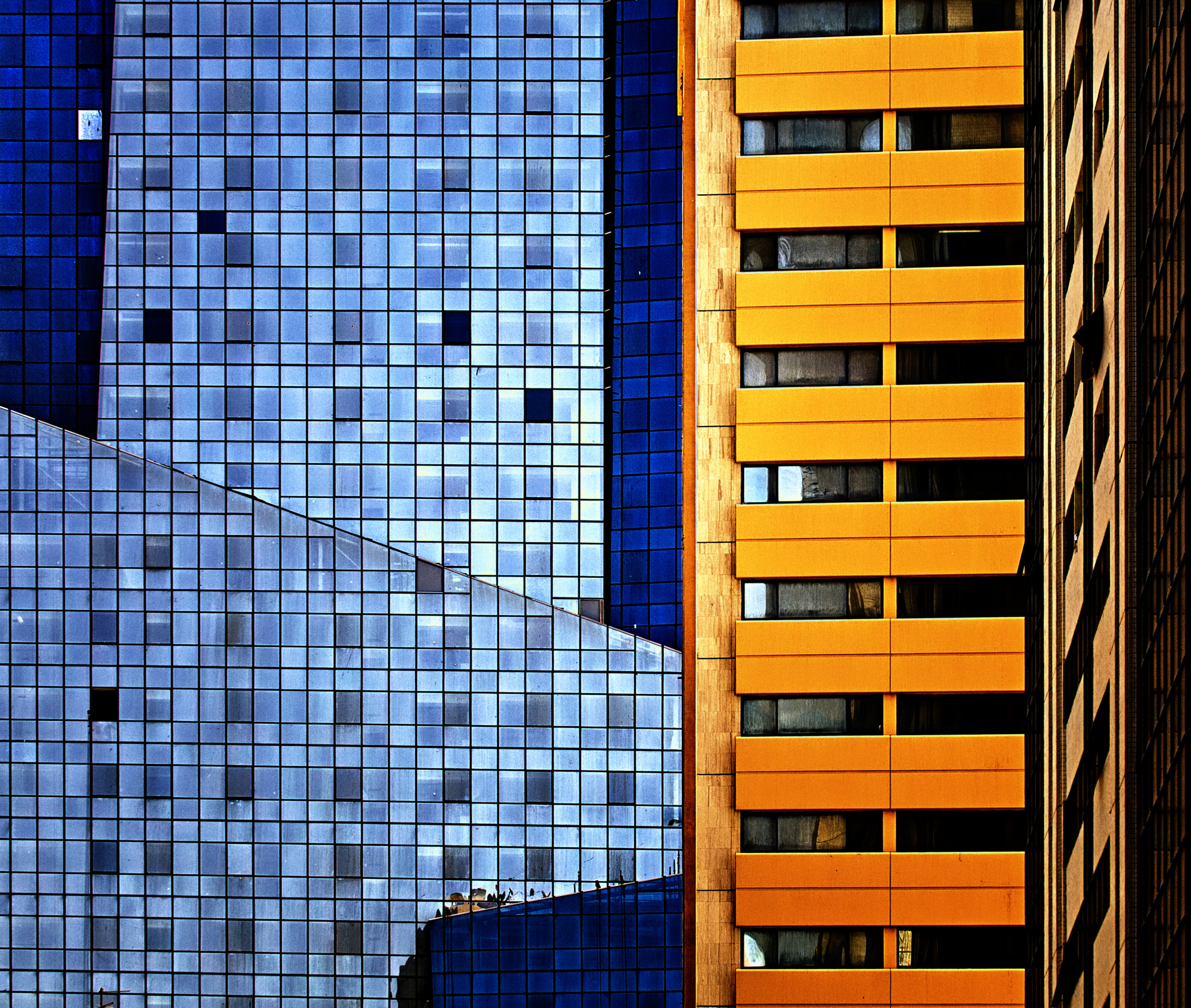
“Abu Dhabi revisited” by Harry Verschelden
Taking a closer look at colour theory reveals two fundamentally different approaches. While the traditional pigment-based system uses the classic light-dark contrast with shades of purple, the additive RGB (red, green, blue) model used by digital sensors creates an effective warm-cool contrast with deep shades of blue.
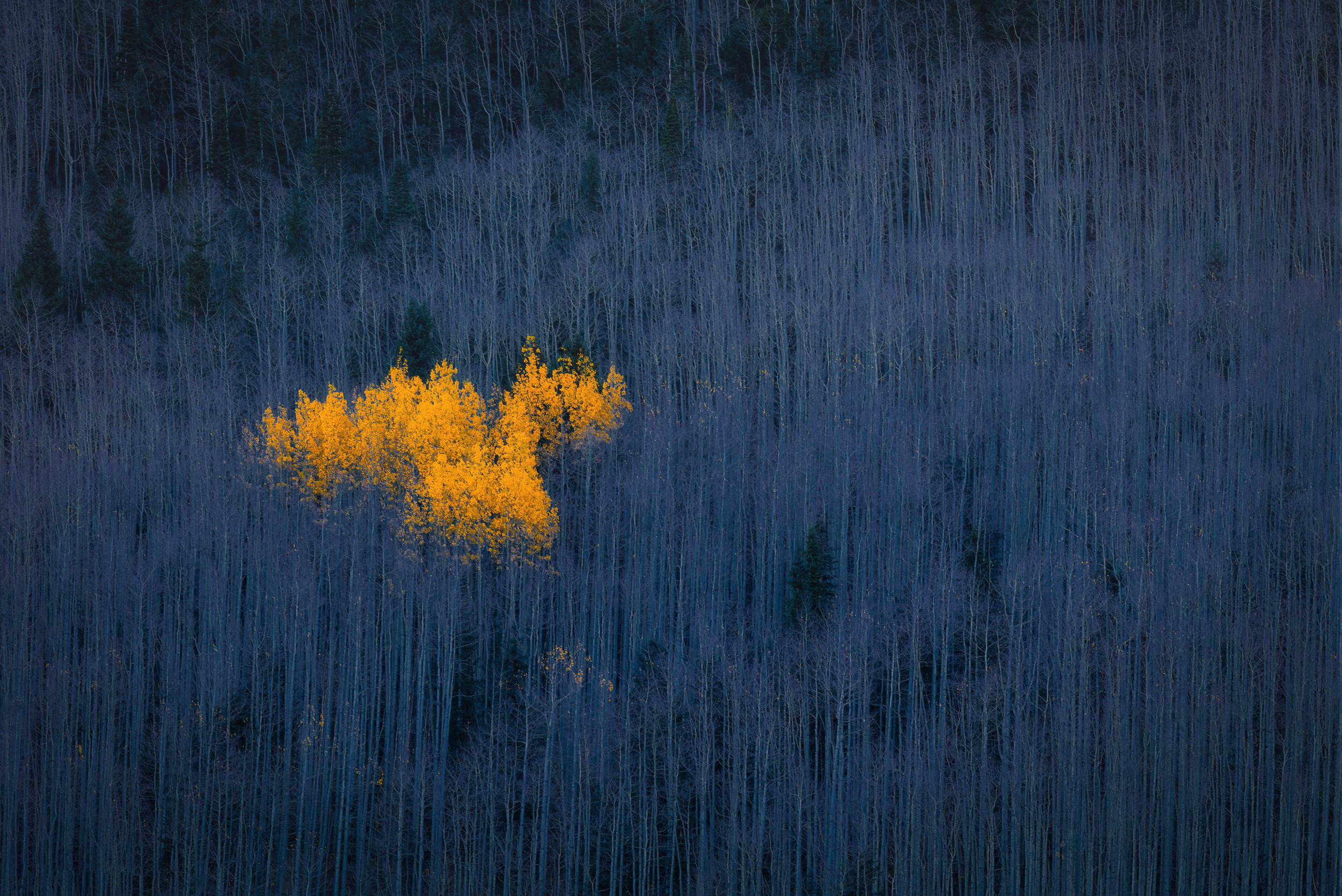
“Heart of Aspens” by Michael Zheng
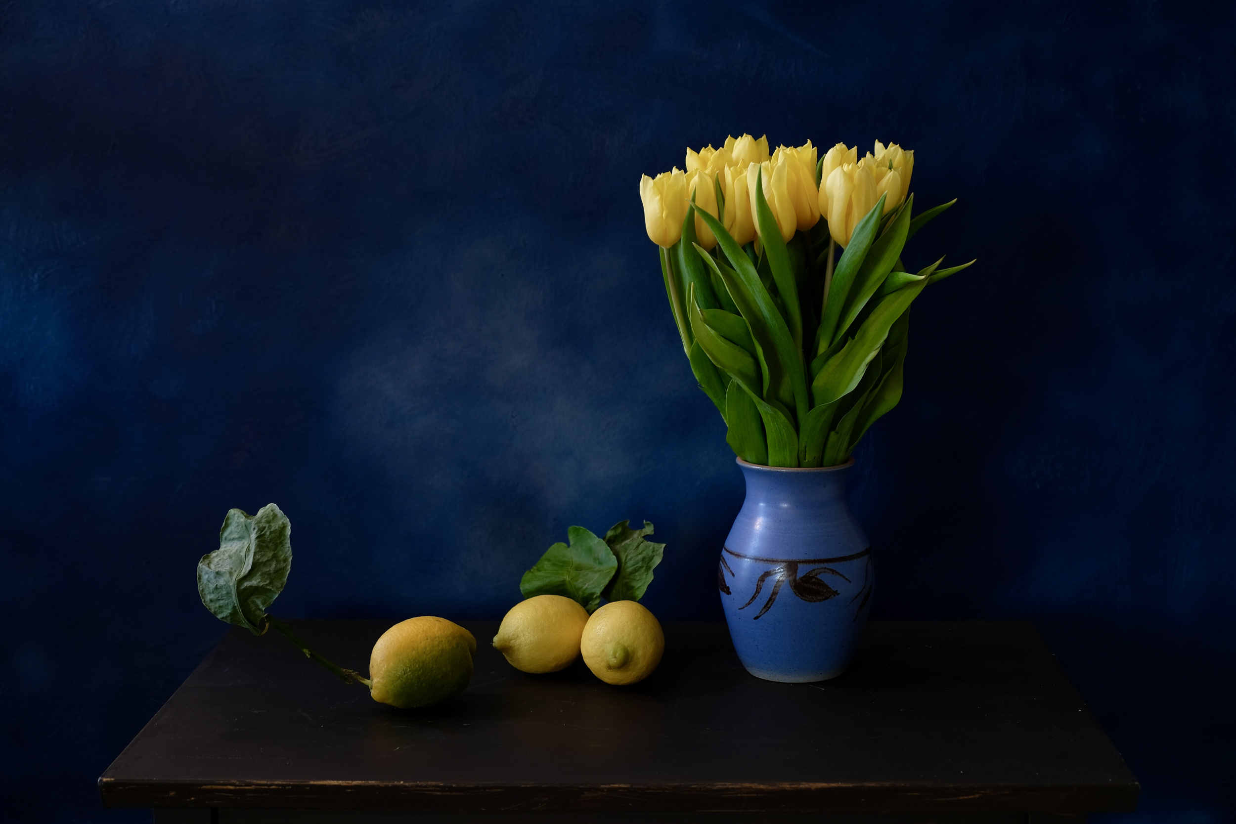
"Playing with colors" by Svetlana Povarova Ree
Black plays a special role in colour classification.
Technically speaking, black is not a part of the visible light spectrum; it is more the absence of light than a specific wavelength within the physical light spectrum. However, it is fully supported as a numerical value in digital RGB systems.
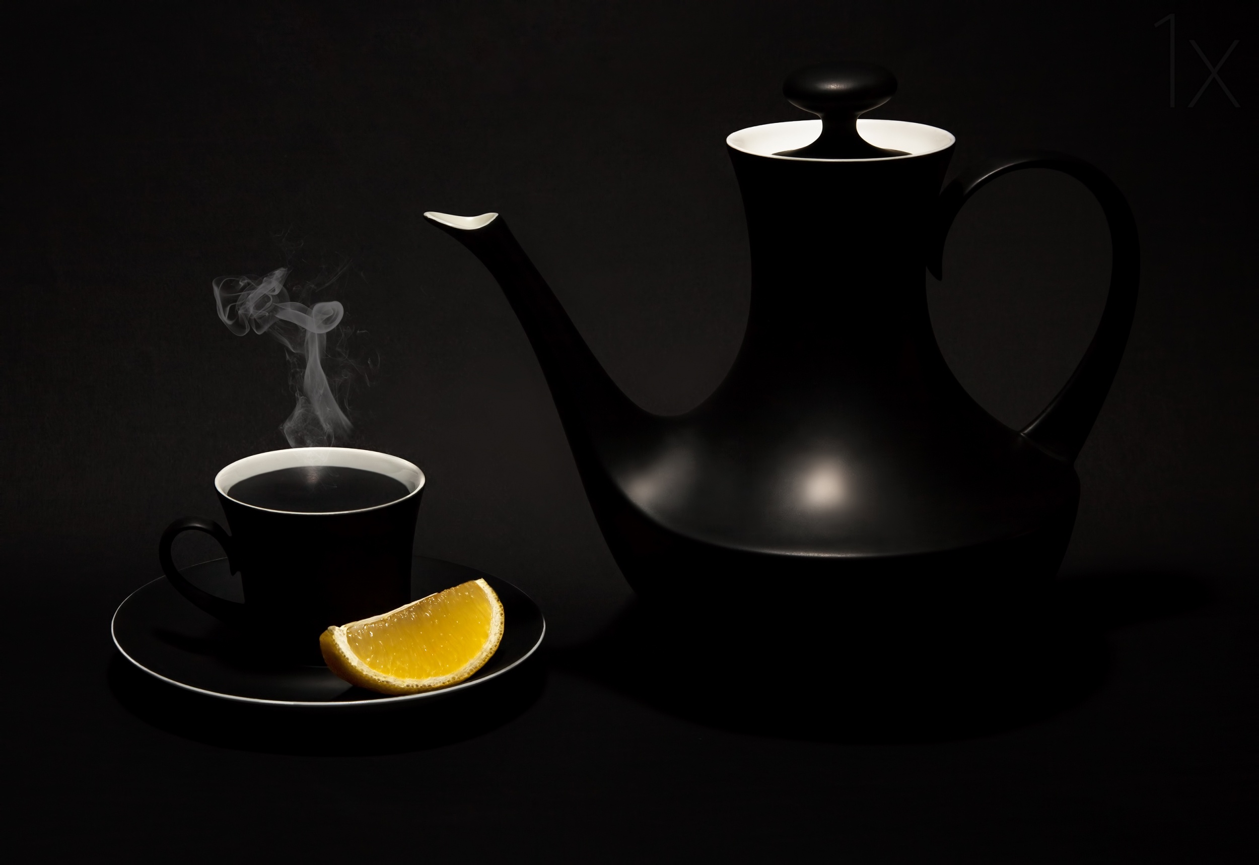
“Black tea with lemon” by Evan Oz

“A Sour Taste” by Lydia Jacobs
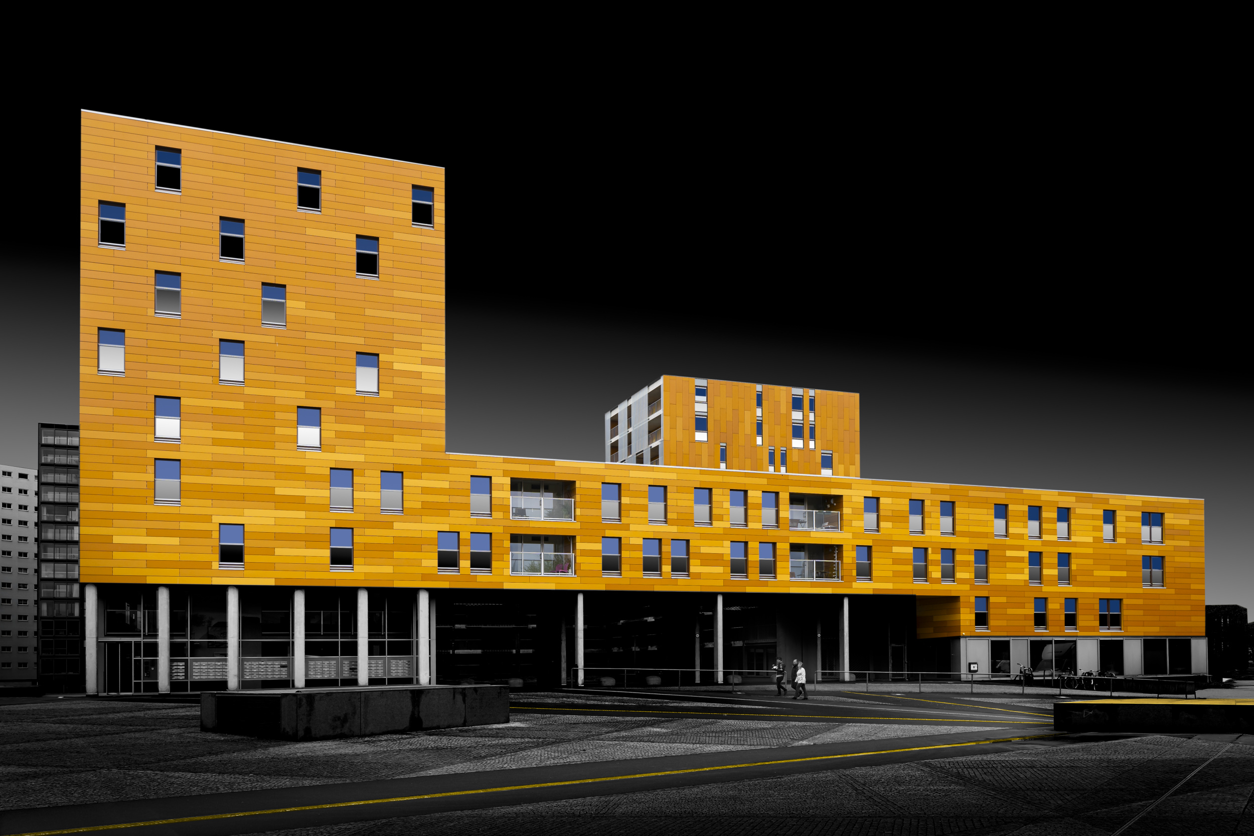
“Follow the Yellow lines” by Greetje van Son
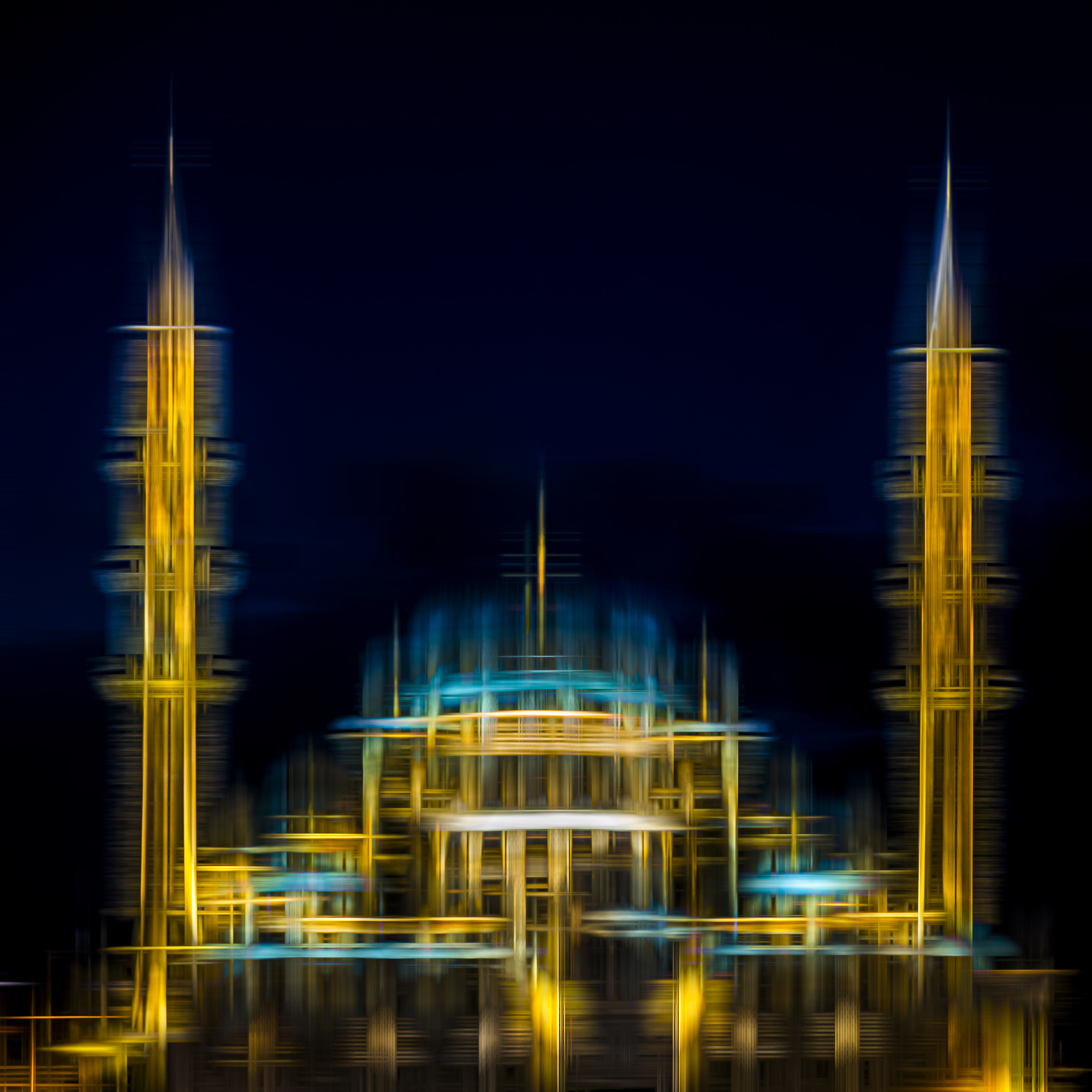
“Mosque abstract” by Dieter Walther
In this article, we analyse the physical and psychological mechanisms behind these colour combinations, using practical examples to demonstrate how complementary colours contrasting with yellow can be employed as a precise tool for image composition.
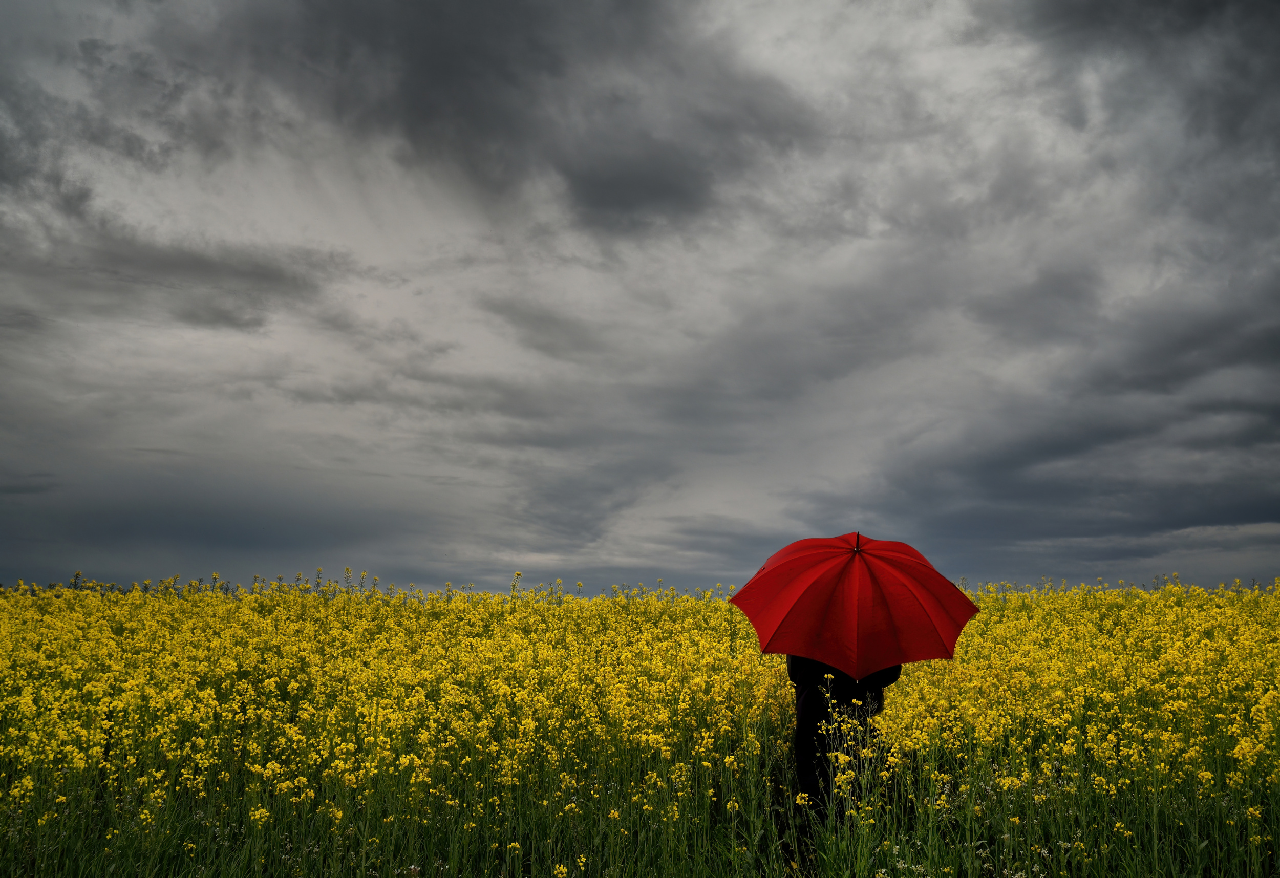
“Woman with a red umbrella” by Claudio Moretti
The artistic contrast: yellow and purple in subtractive colour theory.
The combination of yellow and purple is based on the traditional subtractive colour model developed by Johannes Itten, who was a Swiss painter, art theorist and educator who taught at the Bauhaus school in Weimar, Germany.

“Blue Rays” by Þorsteinn H. Ingibergsson
In photography, the combination of yellow and purple is particularly significant:
it represents the greatest contrast between light and dark in the entire colour spectrum.
As pure yellow has the highest intrinsic brightness of all colours and purple is the darkest spectral colour, using these colours achieves the maximum dynamic range. In classical painting and design, combining pure yellow and pure purple creates the strongest possible light-dark contrast amongst the primary colours. These are also complementary colours, which further maximises the visual impact.
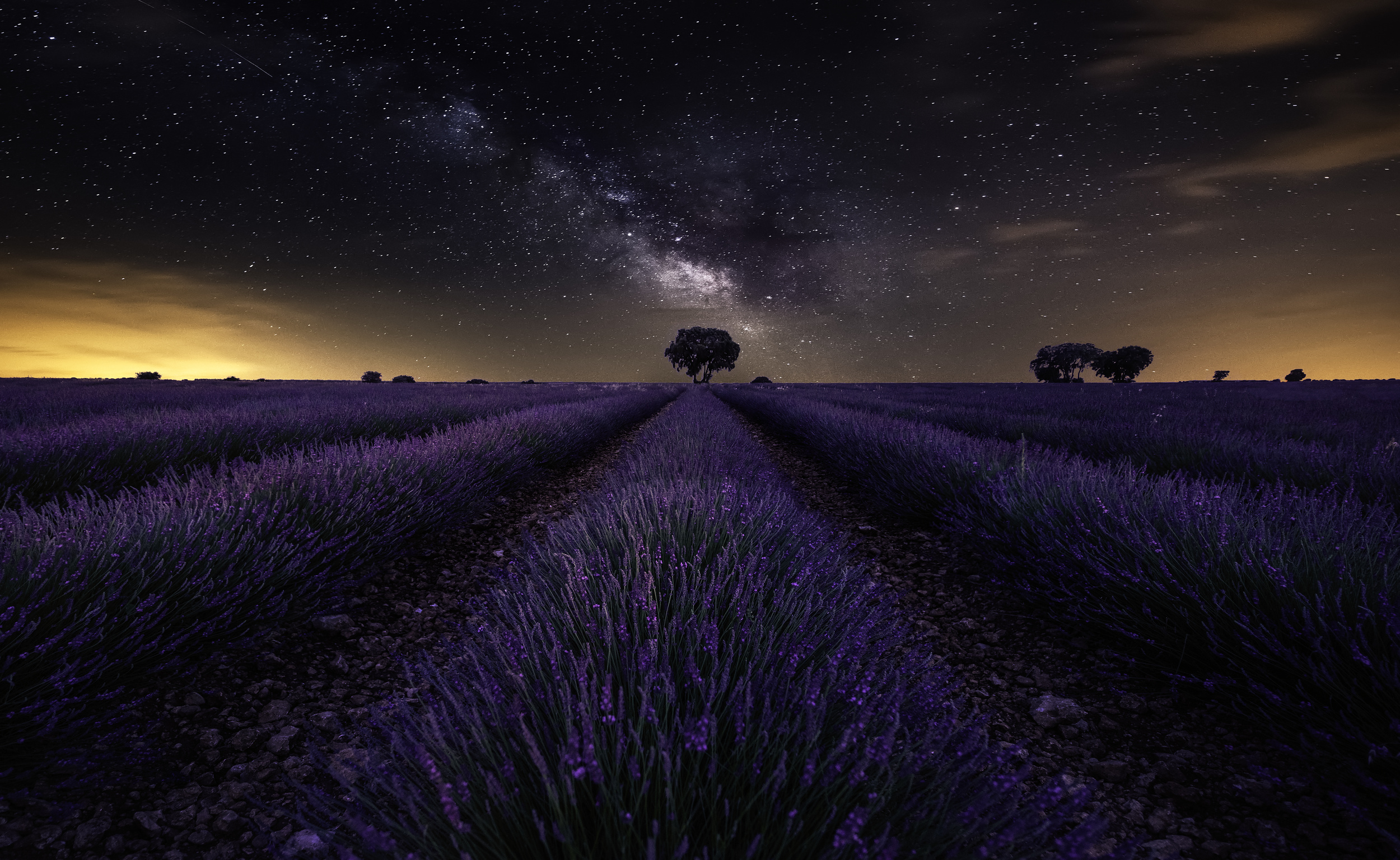
"Fields of Castilla” by Jorge Ruiz Dueso
Visual impact
Purple appears heavy and distant, yet comforting. Yellow, on the other hand, appears light and pushes forward visually. Together, they give the picture an almost mystical depth and elegance. When placed against a purple background, shades of yellow appear not just striking, but also luxurious and three-dimensional.
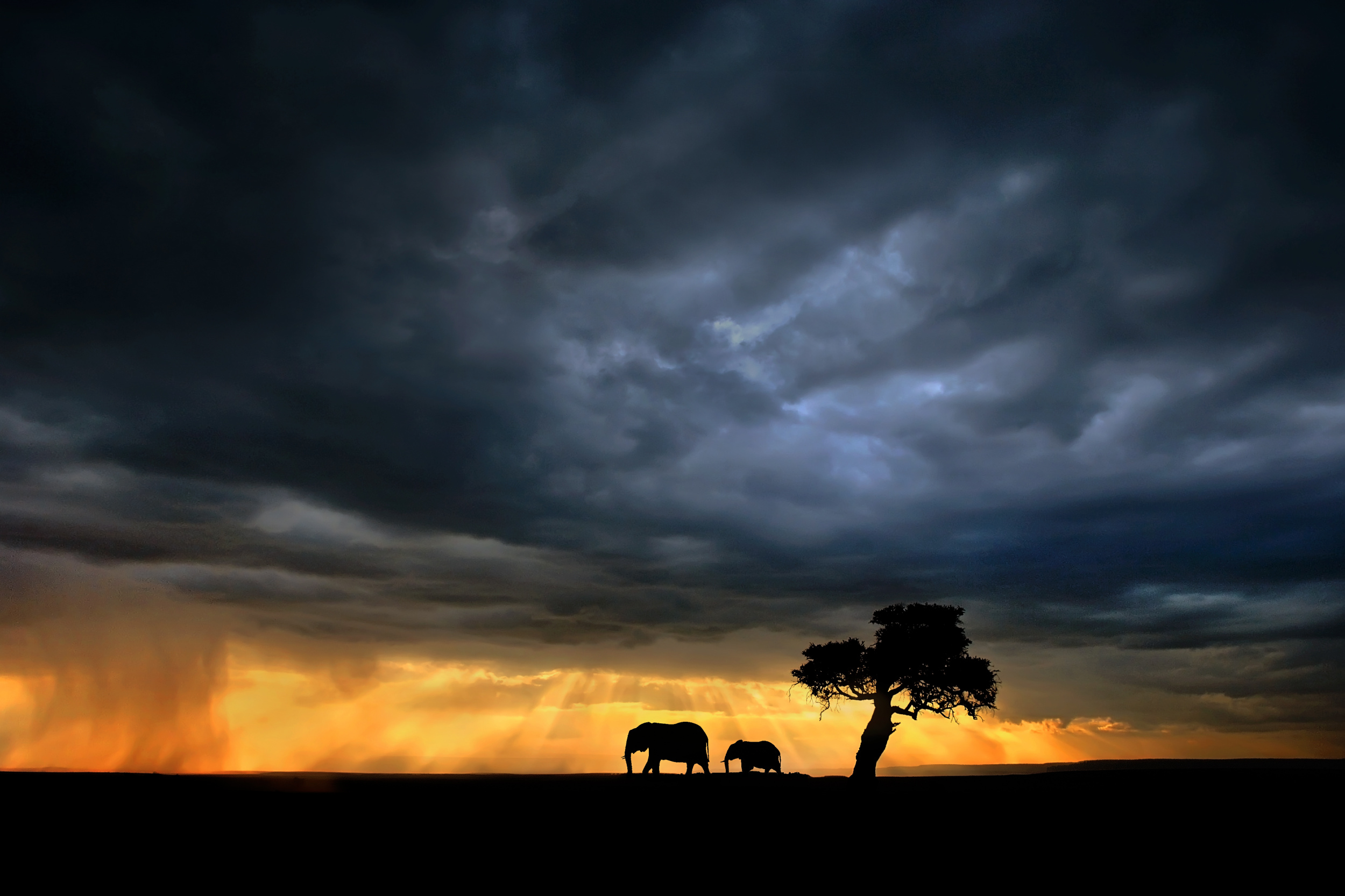
“Elephants on the Mara plains” by Xavier Ortega
Photographic Practice & Motives
In nature and macro photography, this contrast is used automatically. Yellow flowers, such as sunflowers, stand out against purple or blue backgrounds, or against darker purple shadows in the soft light of a sunset.
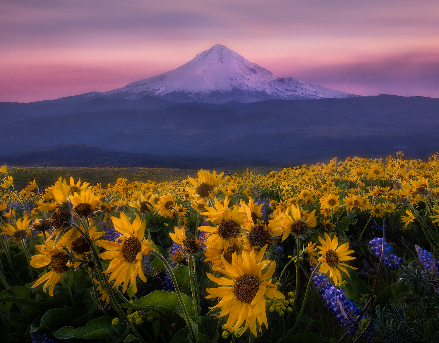
“Mt. Hood” by Johnny Chen

“Flamingos in a lake with a tree” by Bess Hamiti
For fine art portraits in the studio, use a deep purple accent light from behind to emphasise the silhouette of the hair whilst modelling the face with a warm, slightly golden light.
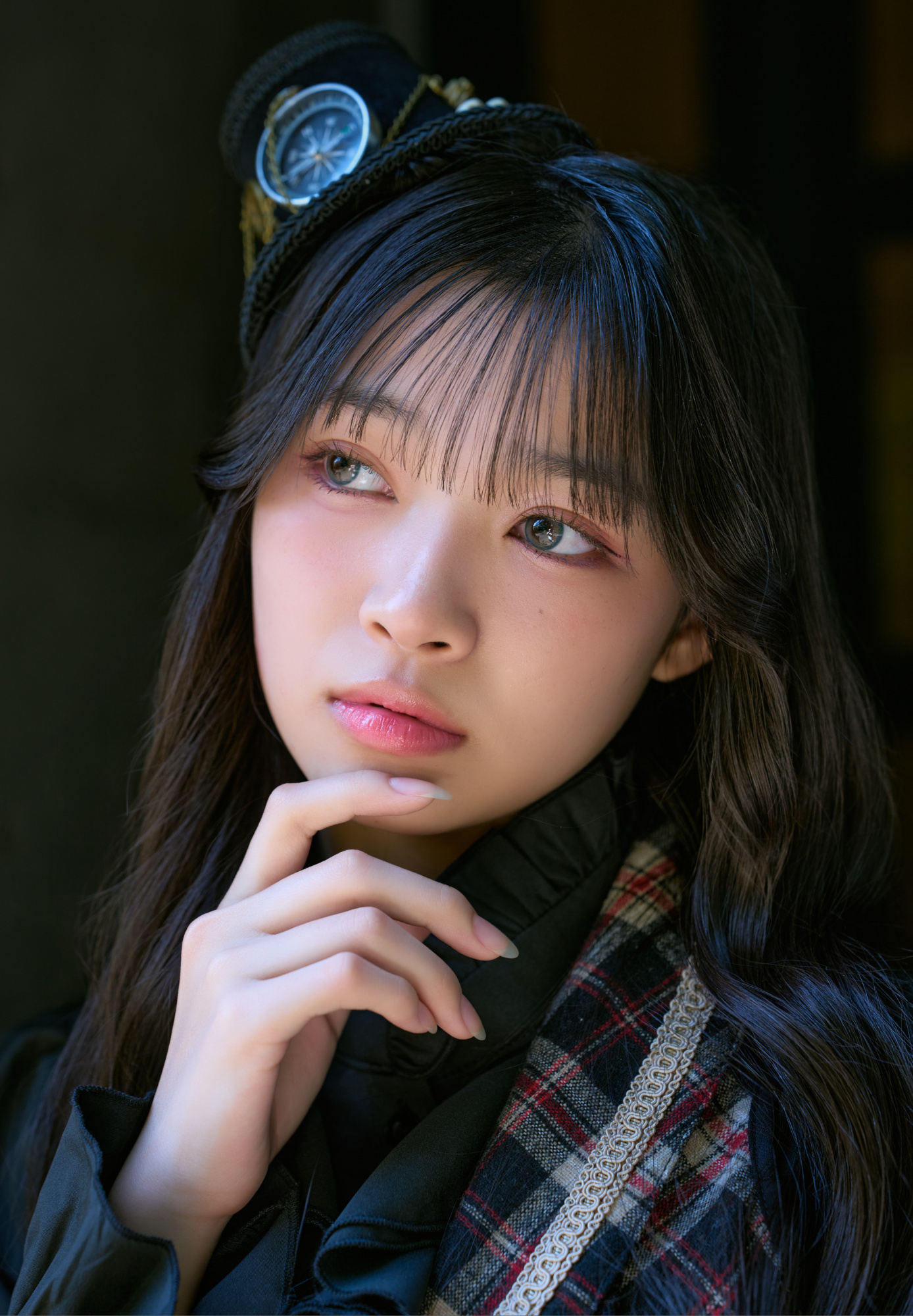
Untitled by Charu Fujiki
Design hint
As yellow is an extremely eye-catching colour, the proportions must be carefully adjusted. According to J. W. von Goethe, the harmonious ratio of yellow to purple should be 1:3, and a small yellow dot against a purple background is sufficient to guide the viewer's eye.
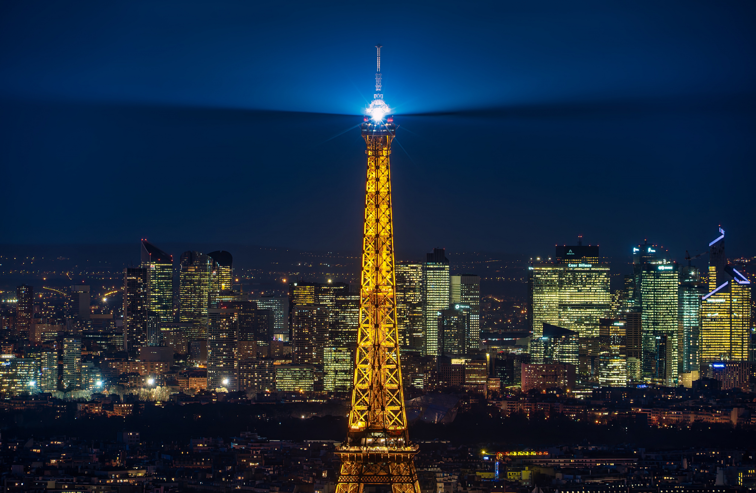
“Paris” by Sus Bogaerts
The physical contrast: yellow and blue in the digital RGB colour space
Shifting our focus from classical painting to modern sensor technology brings the additive RGB colour model (red, green and blue) into effect.
At the pixel level, the exact complementary colour to yellow is pure, saturated blue. In photography, this creates the most striking contrast between cool and warm tones that the human eye can detect.
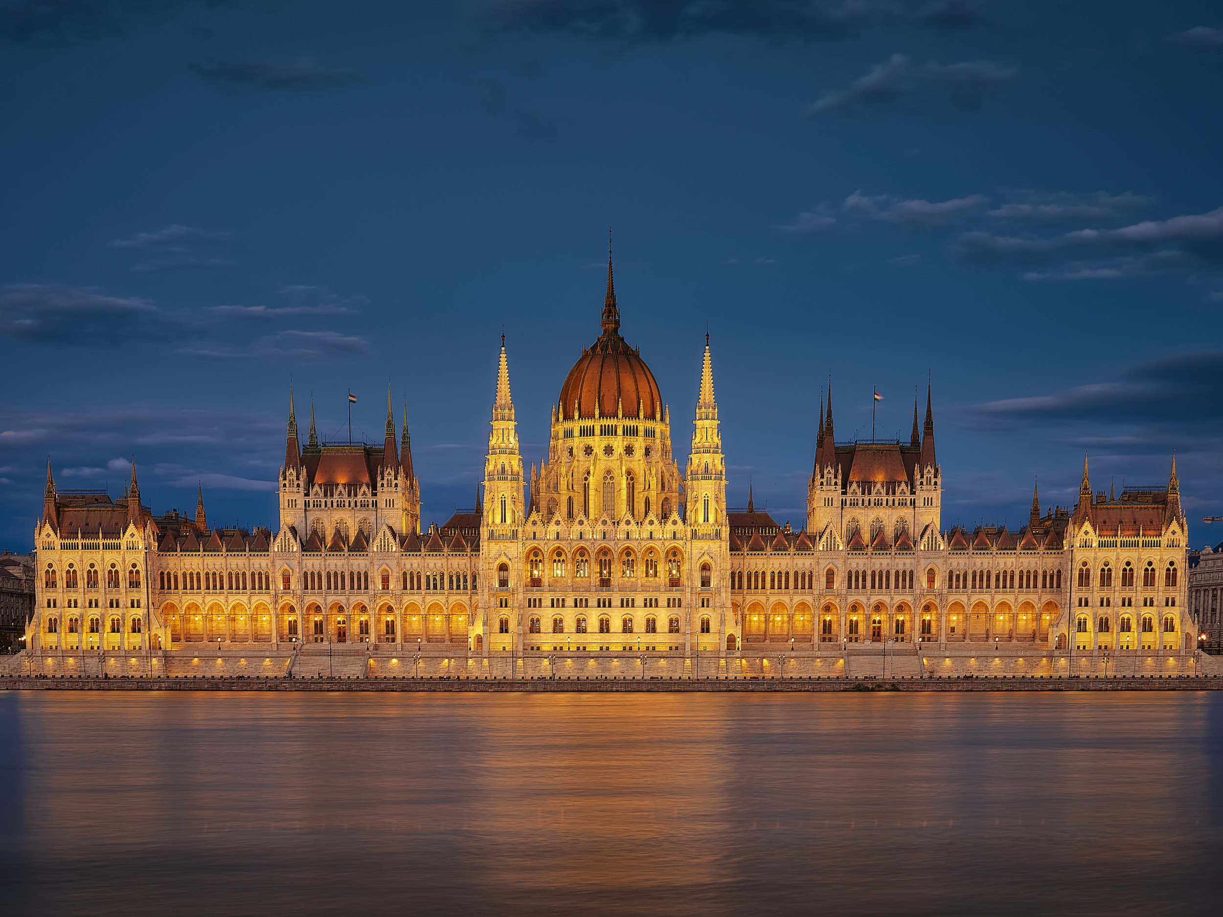
“Hungarian Parliament at night” by Silviu G
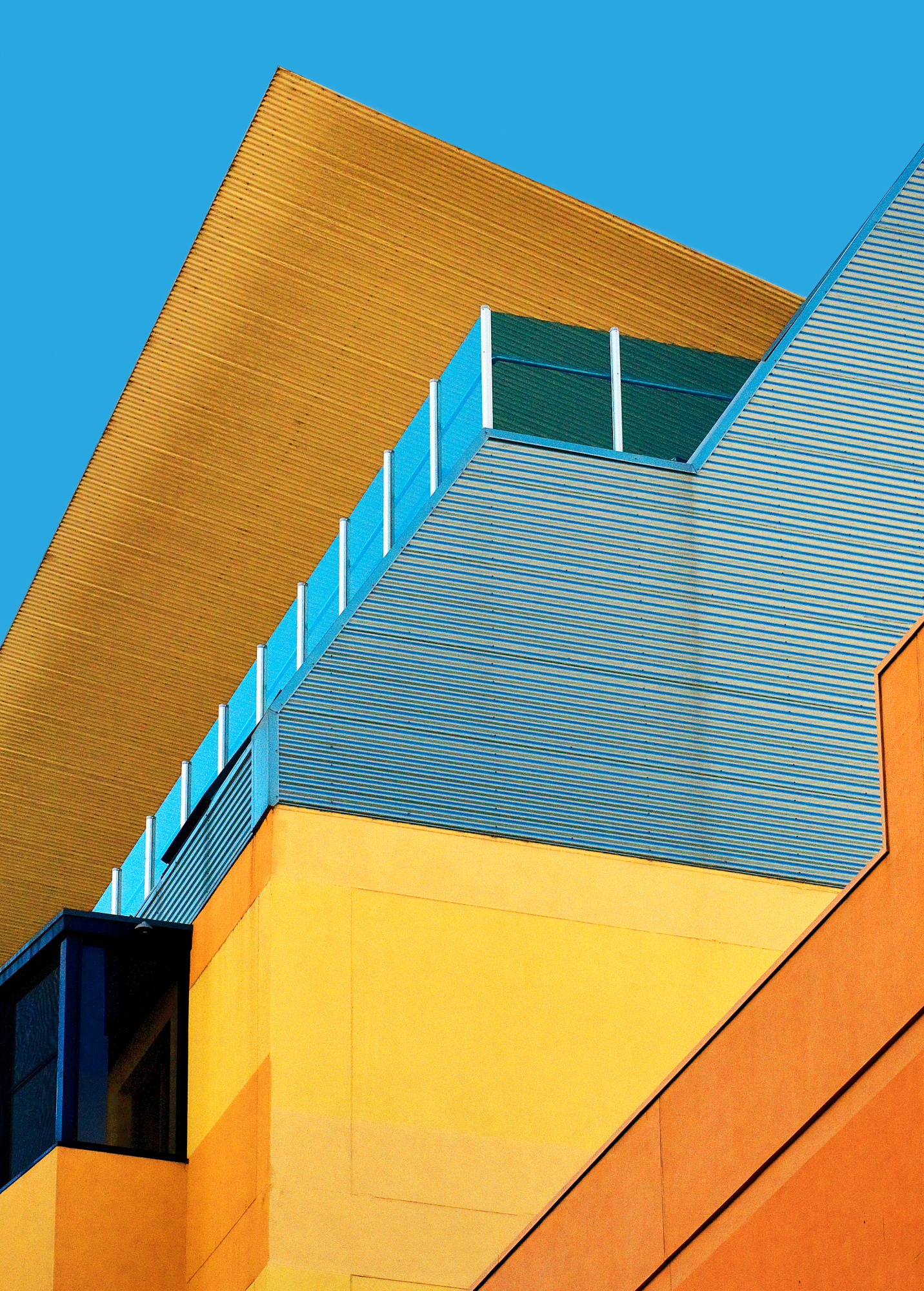
“Sky Art” by Wayne Pearson
Visual effect
Our brain instinctively associates blue with cold, distance and calm (such as shadows, water and the sky), while yellow is linked to warmth, closeness and energy (such as the sun and artificial warm light).
This contrast creates a striking sense of three-dimensional space in the photograph: warm shades of yellow appear to 'move' towards the viewer, while cool shades of blue recede into the distance.
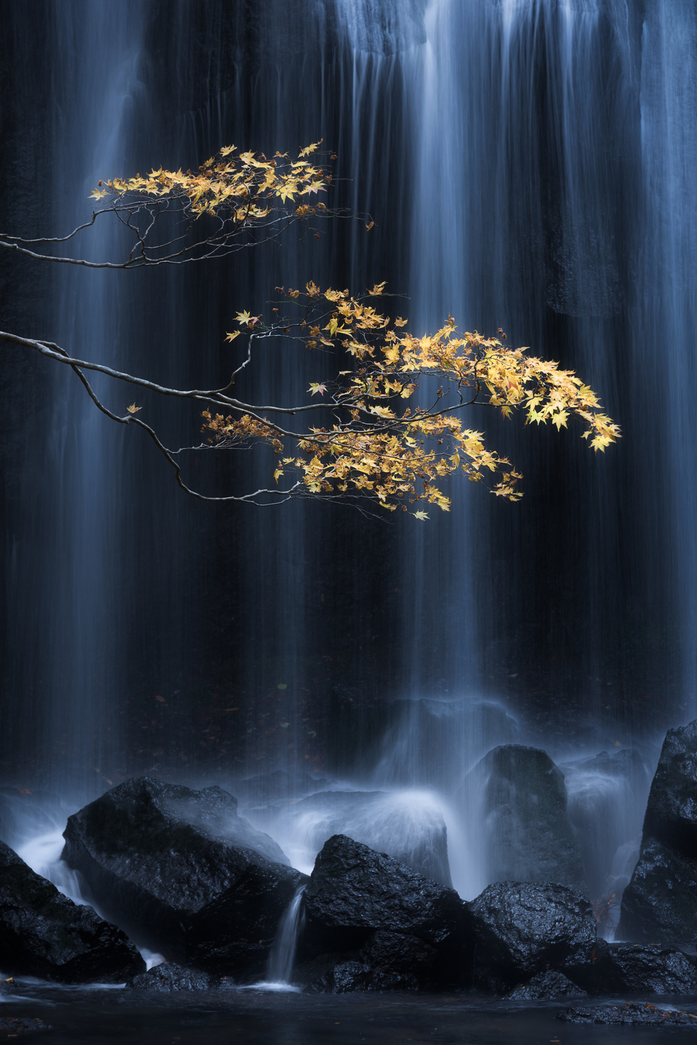
“Yellow Autumn” by Yuki Yatsushima
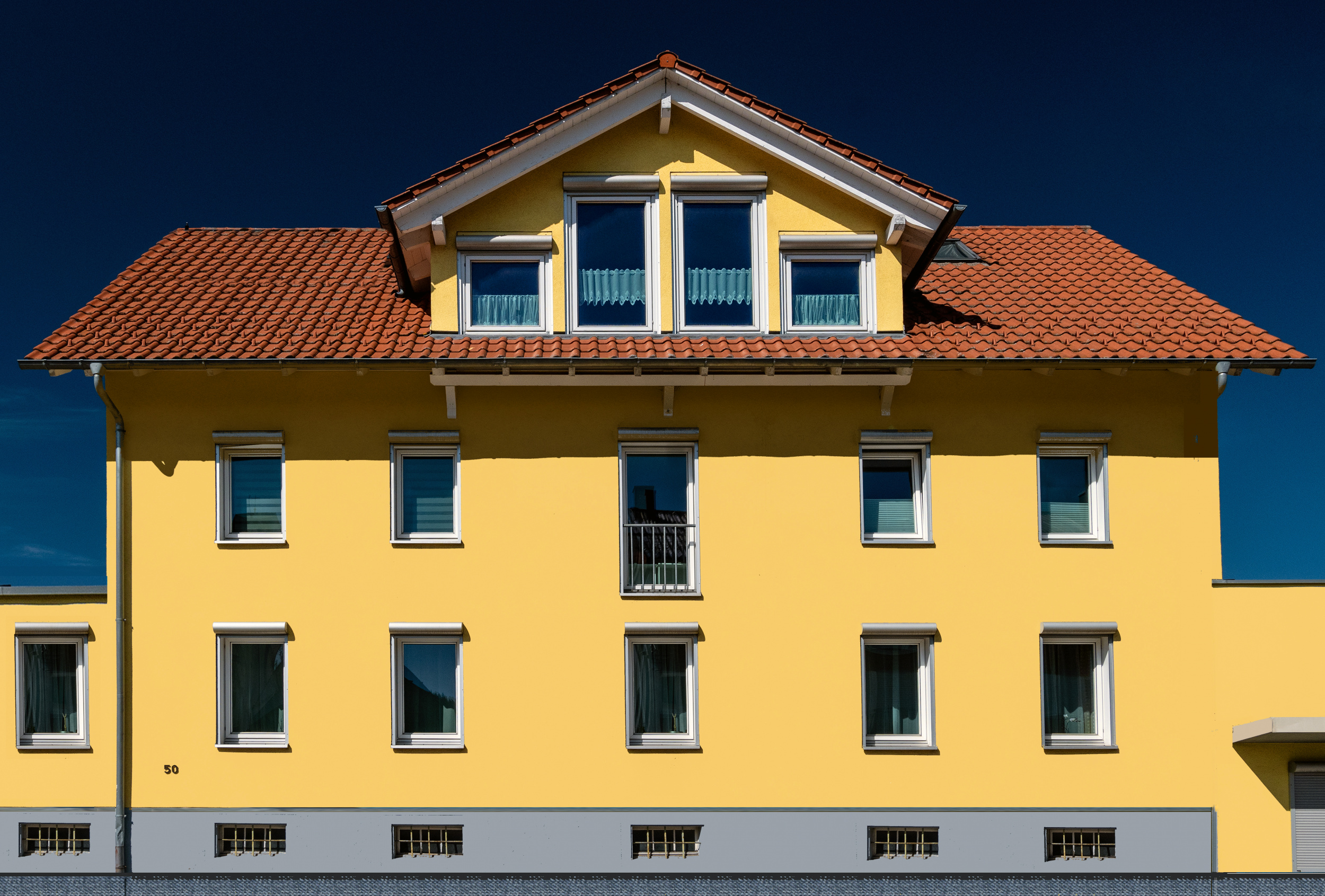
“Somewhere in Switzerland” by Miro Susta
Photographic Practice & Subjects
In architecture and street photography, it is a classic technique to capture the scene during the blue hour or at night. The deep blue of the residual natural light in the sky provides the perfect backdrop for the warm yellow glow of building windows and streetlamps.

“Prague is awakening” by Marcel Rebro
In landscape and astrophotography, the sight of a yellow-lit tent set against a rugged mountain landscape beneath a deep blue night sky instantly evokes a sense of emotional security in the wilderness.
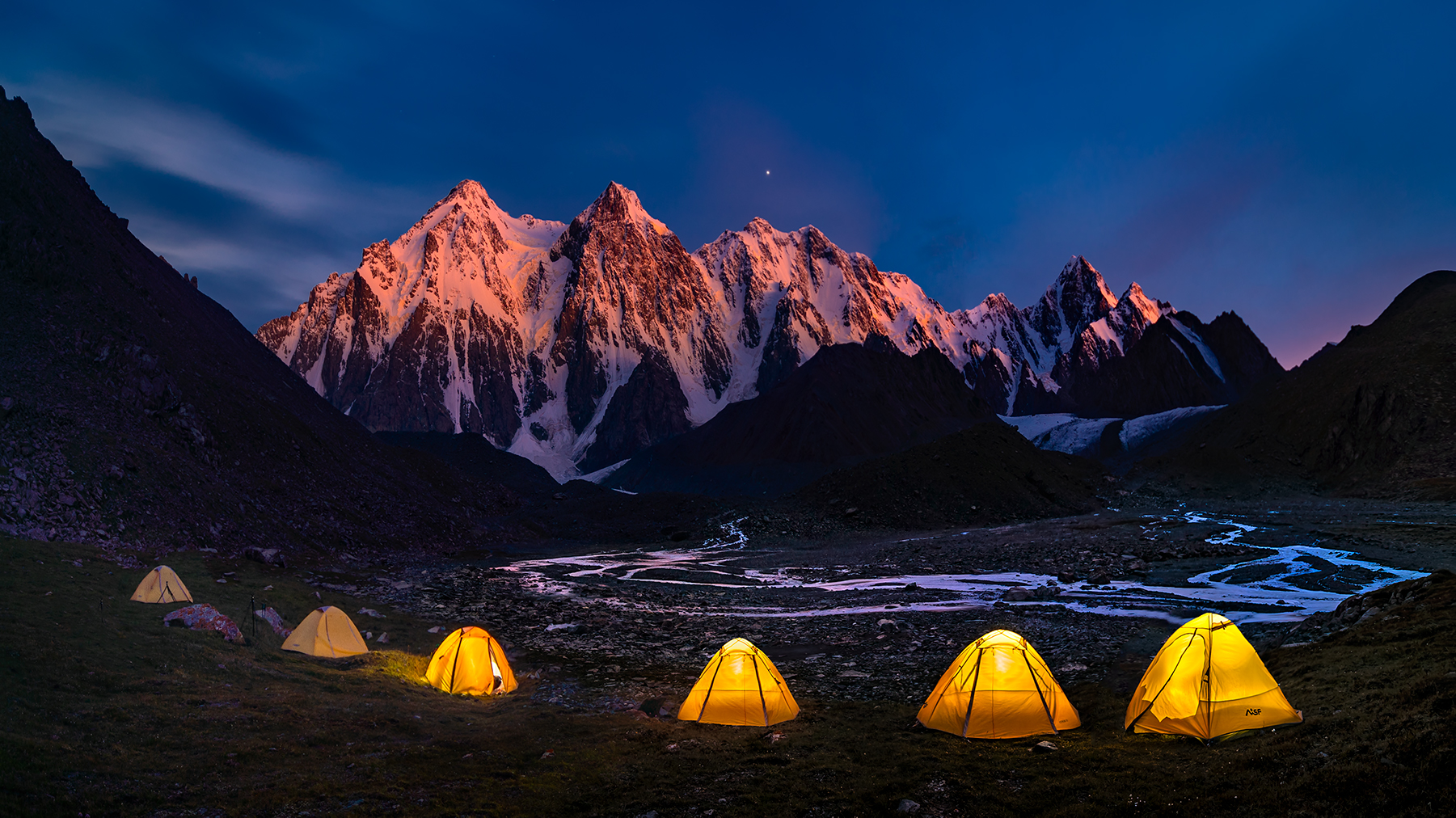
“Camping at Bogda” by Hua Zhu

“Camp Baobab” by Marsel van Oosten
The deliberate use of complementary colours elevates this photograph from mere documentation to a carefully crafted visual composition.
Whether it is the dramatic light-dark contrast with shades of purple, as per classical colour theory, or the deep, spatially evocative warm-cool contrast with blue in the RGB colour space, contrasts create order and a visual hierarchy within an image.

“Lake House sunrise” by Jesús M. García
In practical photography, this means not just accepting colours as they are, but planning them as active compositional elements from the moment you select a subject or step into the studio.
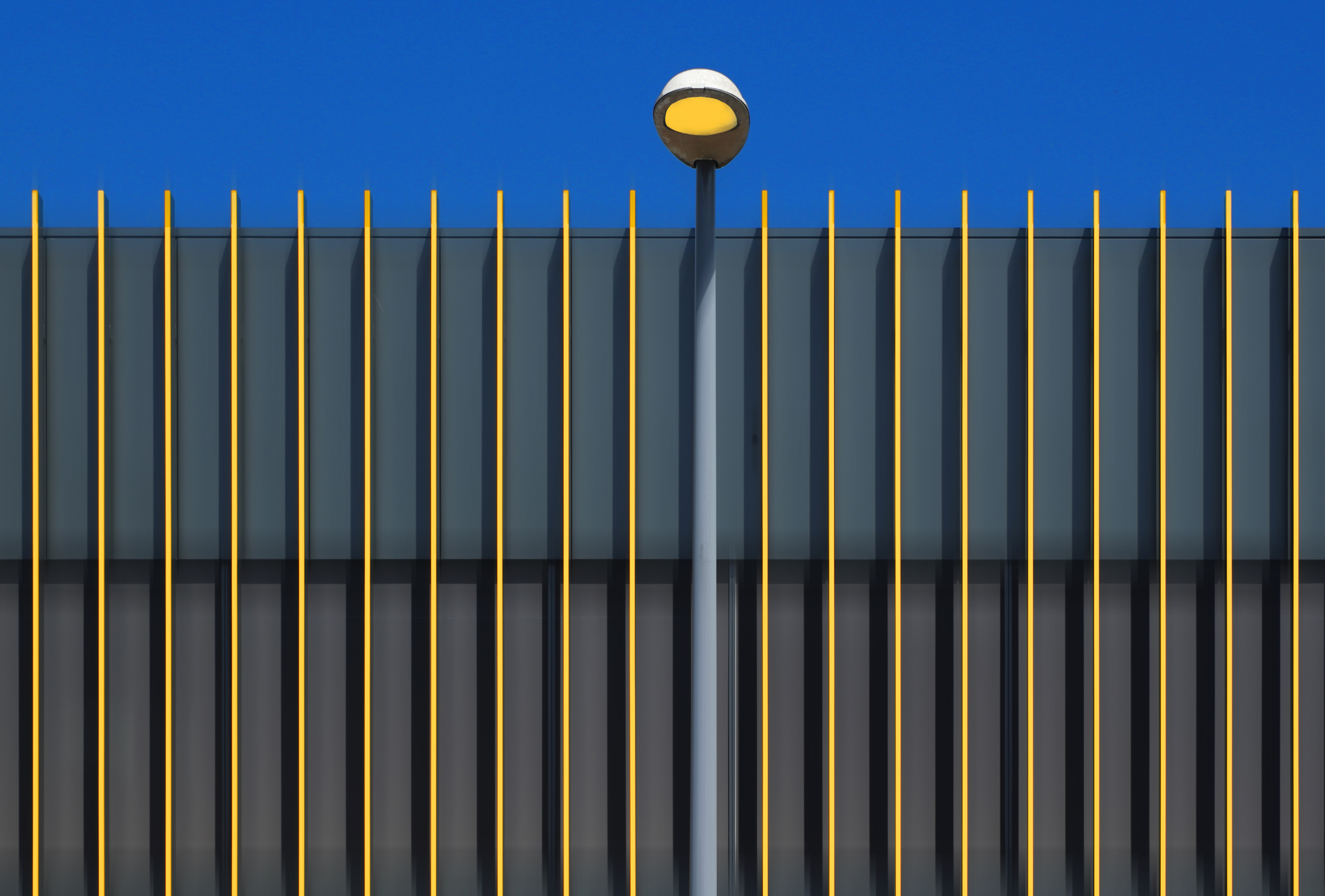
“Yellow Stripes” by Hans-Wolfgang Hawerkamp
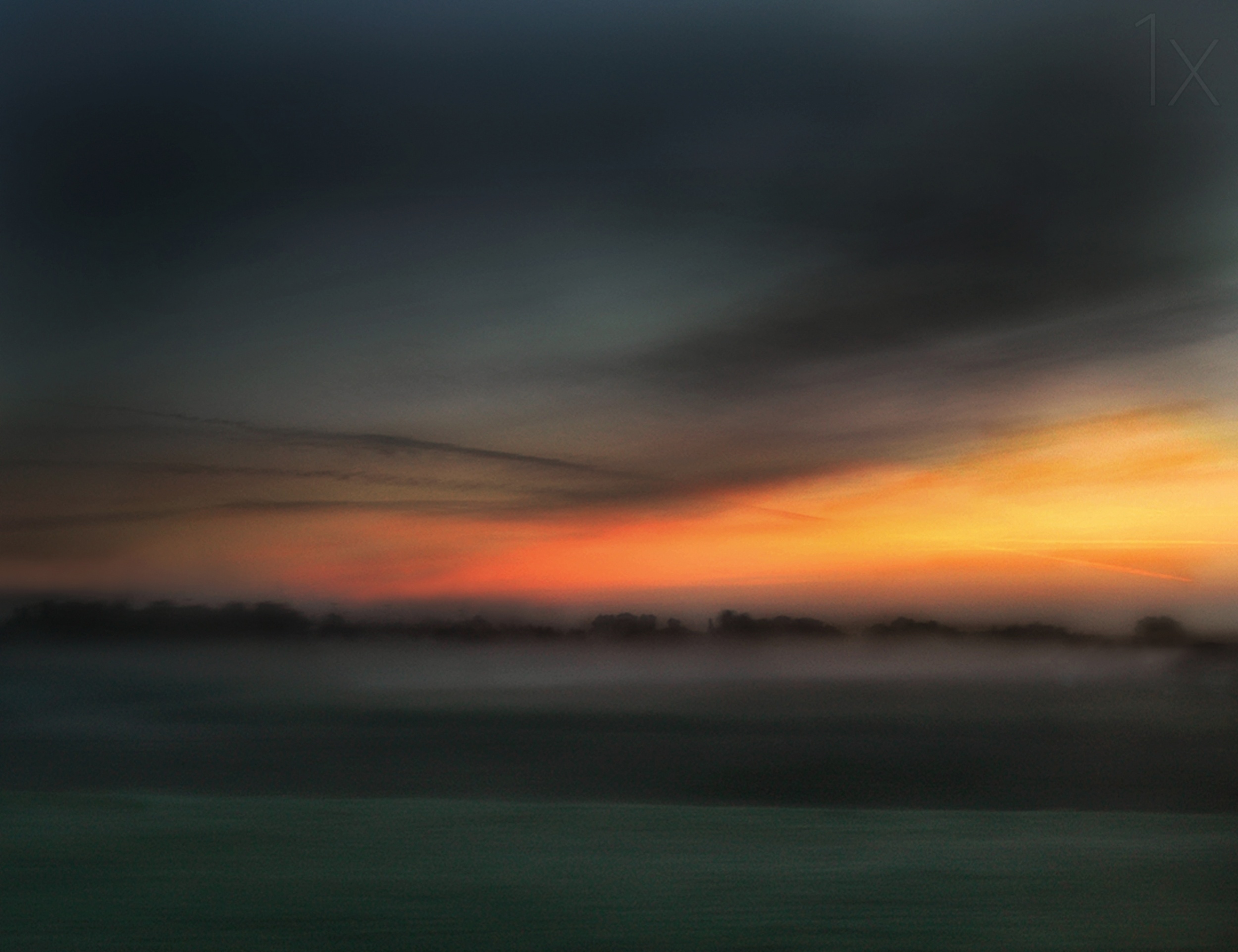
“Dawn's golden hour” by Yvette Depaepe
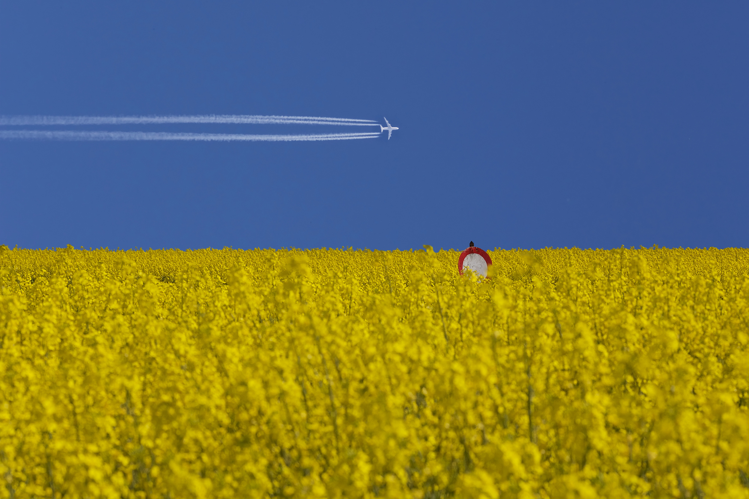
“No landing zone” by Udo Dittmann
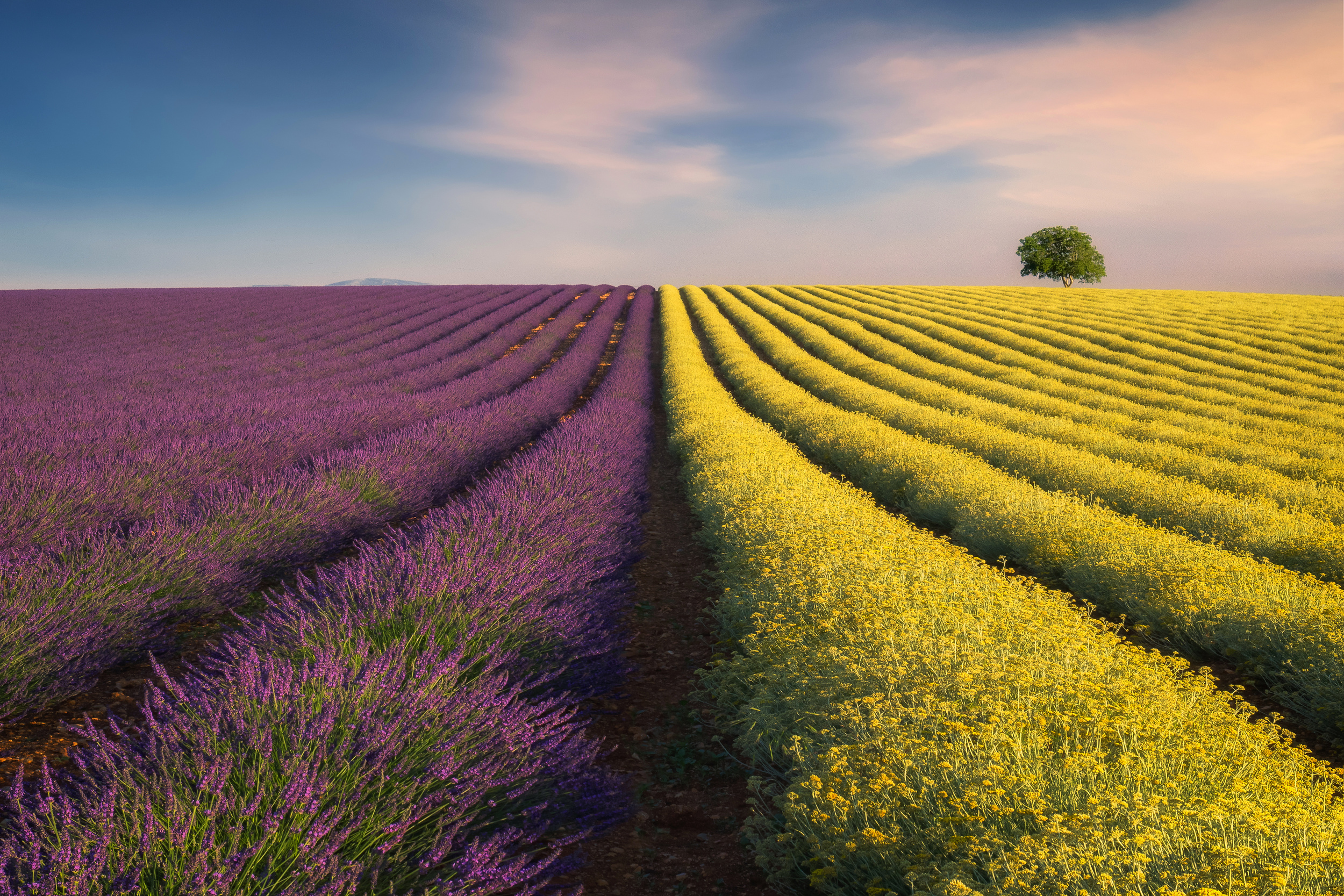
“Violyellow” by Ales Komovec
Ultimately, the harmonious balance of proportions and precise control of the white balance in RAW format ensures that the immense luminosity of the yellow never results in overexposure or chaos. Instead, the natural visual appeal of the yellow is harnessed to guide the viewer’s gaze with the utmost precision.
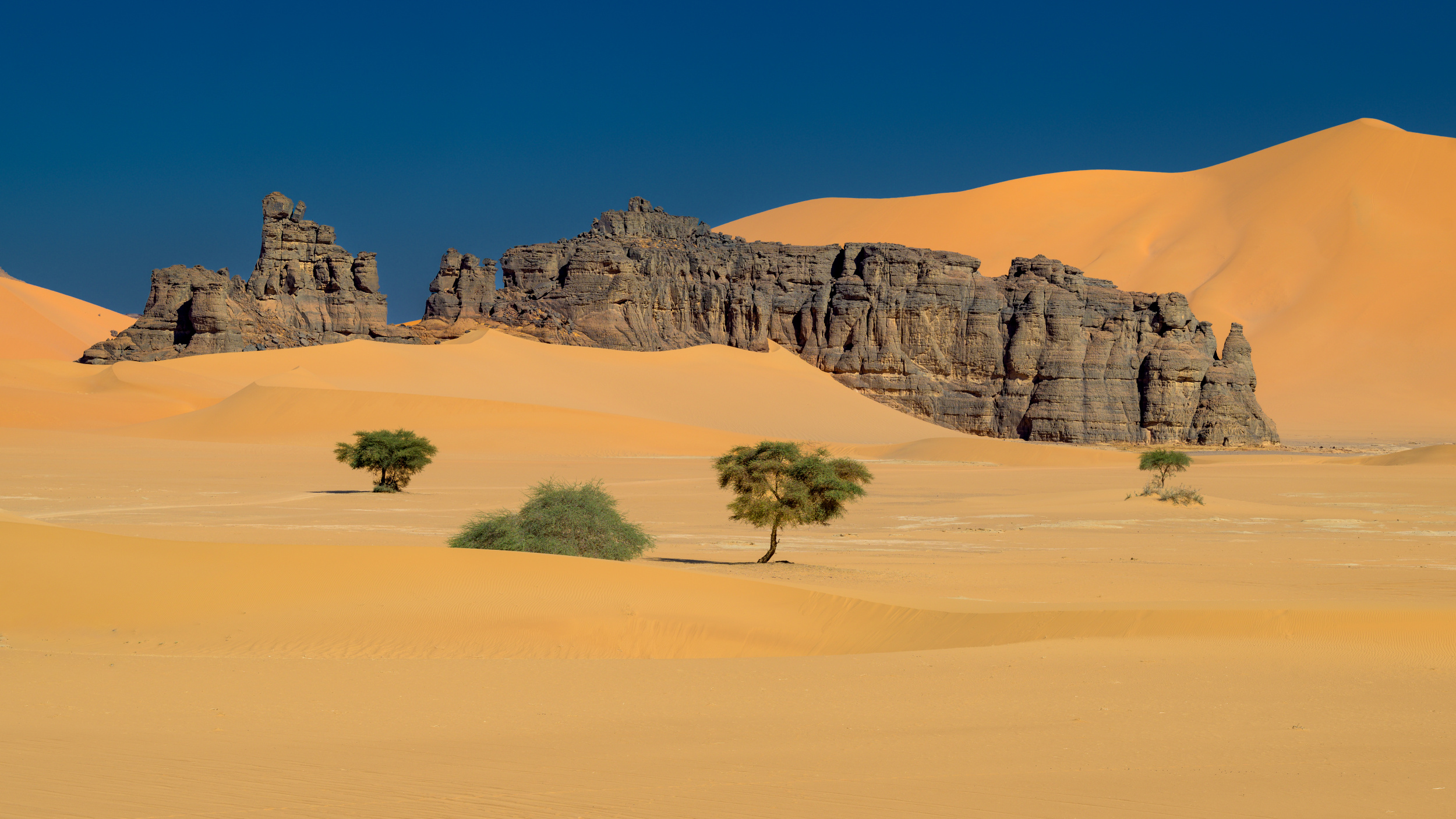
"Tadrard rocks” by Marc Pelissier
Apply your understanding of these complementary dynamics to your next photographic project. Sharpen your eye for the interplay of colours on the colour wheel, as it is often the perfectly placed contrast that transforms a technically sound photograph into a masterfully composed image.
www.mrsphoto.net
[email protected]
 | Write |
 | Udo Dittmann PRO I' am honored to have one of my photos featured in the article. Many thanks to the editorial team, and congratulations to all the other participants as well.
warm regards
Udo |
 | Cristiano Giani PRO Interesting text and fantastic gallery. Many thanks.... |
 | Marc Pelissier PRO Thanks a lot Miro and Yvette for that color harvesting and great article and publication. As often I’m happily surprised to get a picture with so many other amazing pictures .. I really enjoyed a lot going through the text and the images and further to visit the authors |
 | Svetlana Povarova Ree PRO A very interesting and inspiring article, with in-depth research, dear Miro! It showcases some wonderful works in which photographers use yellow in combination with other colours in very creative and varied ways. Thank you so much – it’s a great honour to have my photo included in this collection. A huge thank you to Miro, Yvette and the whole 1x team. |
 | Hans-Wolfgang Hawerkamp PRO thanks a lot Miro for this great honour to be featured again with an image. It´s a much interesting article with a great inspiring factor. Thanks also to Yvette for her work. |
 | Lydia Jacobs CREW Such an insightful and inspiring article! Thank you, Miro, Yvette and the 1x team, for featuring my work. It’s truly an honor to be included alongside so many talented photographers! |
 | Harry Verschelden PRO Very interesting article Miro!
Thanks for including my photo in your article. |
 | Wanghan Li PRO Excellent article plus beautiful collection of the wonderful works! Thanks a lot! |
 | Yvette Depaepe CREW Most captivating article, Miro ... I'll look differently from now on to the colour yellow and the dynamics of combining it with other colours.
My compliments, dear friend! |
 | Greetje van Son PRO What a wonderfull and interesting Article Miro. With much pleasure I looked at the beautifull photo's. Thanks a lot to choose one of my work for this article. And thanks to Yvette for publishing. |
| Yvette Depaepe CREW My pleasure, Greetje ... |